Wednesday, September 22, 2010

How to Change the Appearance of Links Using CSS

This tutorial will teach you how to change thefont weight, color, and decoration or effect of links using CSS.

This is how your dreamweaver screen would look like

1. Find your links in the main screen they should look like this


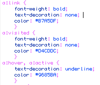
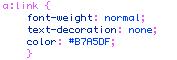
2. To change the font weight from all the links we have to edit the font weight command “ a:link{}” which is the first set on our list.

To do this we have to double click bold next to font weight and in properties for “a:link” we can pick the font weight we like.

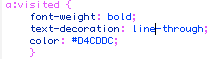
3. To change the “text decoration” of a link that has being visited, find the “a:visited” section

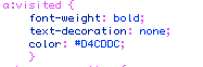
Next to text-decoration: erase none, under properties for “a:visited” we can change the appearance for the visited link.

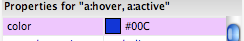
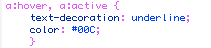
4. To change the color of “a:hover,a:active” link means that the link changes color when you go over it with the mouse. To do this you have to find the “a:hover,a:active” section

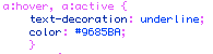
Next to “color:” erase the color code, under properties for “a:hover,a:active” click the color box and pick a new color.

5. Save your work.


Tuesday, August 31, 2010

Site Critique #2

http://moodstream.gettyimages.com/

Moodstream is a pretty was a pretty fun website to navigate. The website is pretty easy to navigate, its purpose is to show you different sounds and images depending on what mood you are in. It is supposed to help you brainstorm by showing you different images, sounds, or footage. So if you felt sad, serious, nostalgic, or warm you can adjust a bar to the amount of emotion you feel and they will show you a set of images and sounds that go with that particular feeling according to the website.

The main page of the site pretty much stays the same it doesn’t change at all except for when you click the button to start streaming. When the next page shows up the different controls with mood slidders. There is also a “moodboard” where you can save different clips of a particular mood.

The colors, images, and sounds in the background change depending on what mood you pick to view. The typography pretty much stays the same all the time. I guess it does have hierarchy since the main menus where you change your mood are on top and at easy access.

I think this site is mostly for entertainment, and it serves its purpose to show you images and sounds according to your mood.

I would say since the site is so easy to use there probably isn’t an age group that is limited to its use.

Site Critique #1

http://creativeartsforkids.org/studentperformances.php

The creative arts for kids website is successful because it seems very organized and the information is easy to find. Important information such as what types of different arts the program offers and also the contact information for the program is very accessible and easy to find. It also has current events right on the main page so that you know what events are going on and when.

Even though there are multiple menus on this website, there is one way of navigating through the website and its by moving the mouse over the menus and then clicking an option. I think it does have a good use of hierarchy; it has the most important information on top such as what is offered and contact info.

The website mostly uses the colors red, blue, yellow, and green, which I noticed are the colors used in their logo. It does have images and most of them show the kids doing some sort of creative art that they have learned in the program. The typography in this website is kept pretty plain, since it’s mostly an informative site I think they tried to make it easy to read and understand.

The main purpose of this site is to give out information about the creative arts for kids program in Massachusetts; I think that the imagery and the text combined do provide good information to the reader.

The audience would most likely be someone looking for information on the school to either enroll their kids in the program or even someone looking to donate time, or money to the program.

Even though I did think the website worked for its purpose, I noticed that at the bottom of the page there are some links that run into the text box on the sides, which makes them a little hard to read.